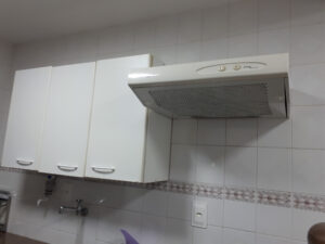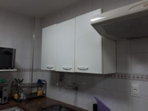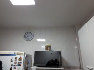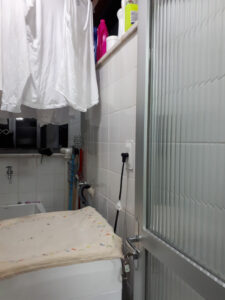
Customers range in age from 40 to 50 years old, with a 15-year-old child. They had lived in this property for around 14 years, and renovations had never been done – and they took the risk of starting with the kitchen.
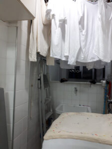
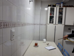
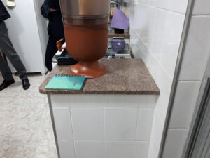
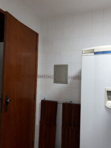
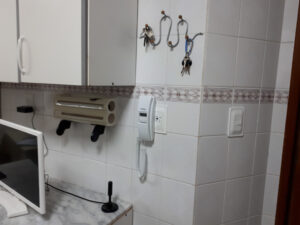
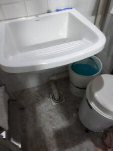
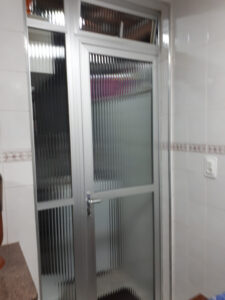
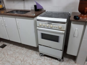
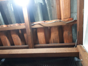
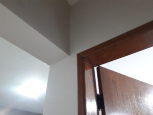
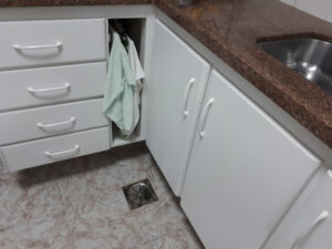
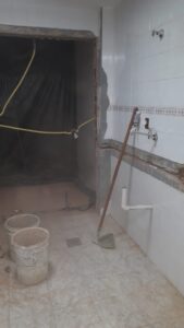
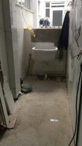
The property had a fully closed kitchen. The only source of natural lighting and ventilation was from the service area, made up of a ceramic tile roof. The position of the washing machine and utensils did not allow for good entry of light and natural ventilation.
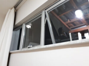
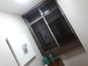
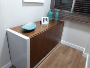
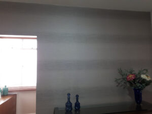
In the social area there was a single window in a small corner, insufficient to light and ventilate the room.
The couple's dream was to have a large kitchen, with a large storage area (we tripled the storage capacity). They talked about an open concept, as they liked watching “Brothers at Work”, from Discovery Home Health.
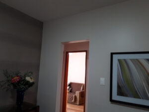
We suggested demolishing the wall that divided the living room, to expand, improve ventilation, lighting, comfort and, of course, quality of life.
There was no possibility for customers to leave the property to carry out the work. Everything had to be “almost yesterday”. And phew! There we went!
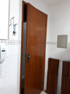
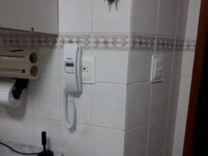
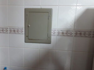
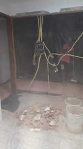
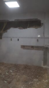
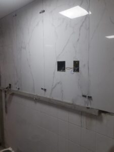
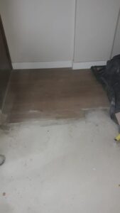
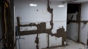
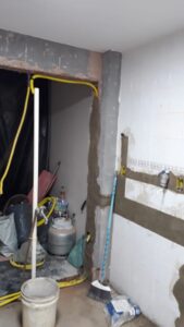
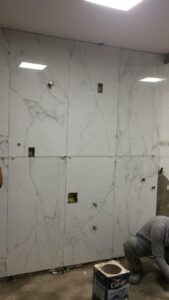
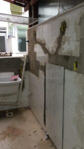
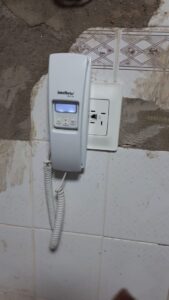
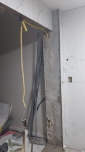
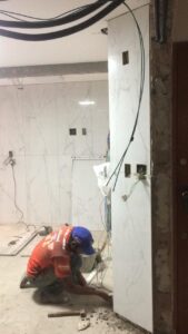
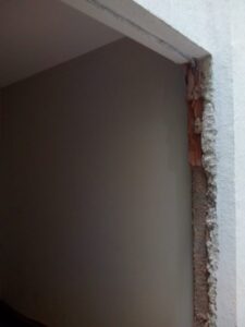
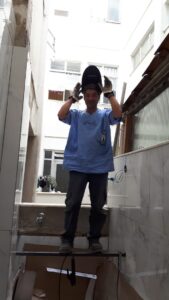
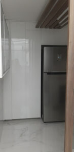
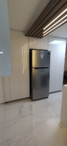
The first step was to demolish the wall that divided the two spaces and transfer all telephone, intercom and light box cabling to another wall. Soon after, we removed the tiles from the walls, changed the positioning of the drains (this was only possible because it was 1st floor), and so we were able to safely pass the gas hose (not piped, but a gas cylinder), to the area where it was stored with greater ventilation and safety. We chose the same porcelain tile for the floor and wall, providing greater space, including in the service area, where we also made plumbing and electrical changes.
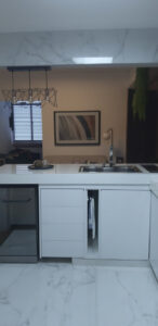
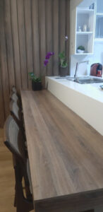
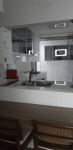
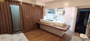
We created a peninsula in white quartz, where there is the sink, dry gutter and, to compose it, an MDF countertop, connected to it for meals. A tower with sockets for connecting power to notebooks and cell phones was installed on this peninsula.
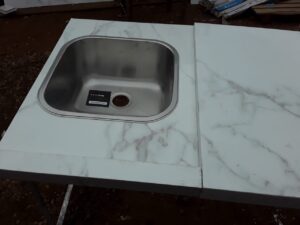
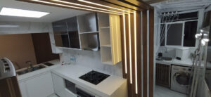
In the area, we used the same porcelain tile (floor/wall) to create the countertop with the new tank. We created a white MDF cabinet for brooms and other items. We fitted the washing machine under the new bench, and repositioned the gas cylinder with slatted doors for greater ventilation. We replaced the conventional roof with an aluminum and retractable polycarbonate cover, installing an aluminum and glass window to provide a little more privacy. Using sconces on the walls improved visibility in the room.
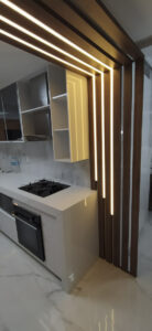
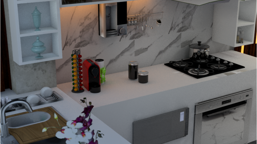
In the kitchen hThere was a beam running the entire length of the kitchen ceiling. We made an MDF panel (L format) on the floor and along the ceiling beam which, at the same time, created continuity with the bench wall, also made the view of the area more private and profiles with LED strip (dimmable) were installed on it. ). A central ceiling light was used for general lighting. On the cooking bench, we use a profile with LED strip (dimmable), under overhead cabinets.
On the wall opposite the peninsula, we designed a china cabinet with Reflecta glass, and inside it we installed a 46” TV for the family to watch while carrying out their activities – cooking, drinking coffee. We use industrial style lighting with retro LED lamps over the peninsula, creating a peaceful atmosphere for meals.
We needed to give privacy to the intimate area and for this we installed a slatted MDF panel along the entire wall with an “invisible” door and a lacquered MDF shelf was installed for decorations and plants.
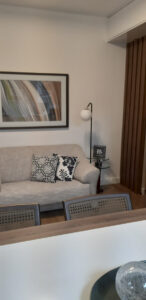
We repositioned the sofa and armchairs (which were covered in rustic linen and suede, respectively), to create the new space. Everything designed to integrate all environments. In the corner next to the window we created a relaxing environment with triple pendant lighting (dimmable)
Our objective, from the detailing of the project and the choice of quality materials, is to provide the family with practicality for carrying out day-to-day tasks, safety, comfort, health, well-being and quality of life.

